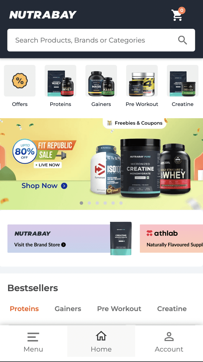
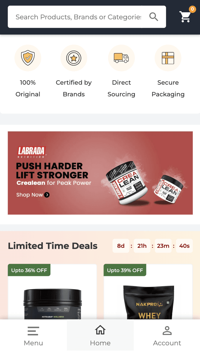
Nutrabay Homepage and Navigation
Improving navigation and exploration
Role
UI & UX Design
Team Size
1 Product Designer
Project Length
1 - 2 Months
Date
November 2024
Results
Boosted user satisfaction by 20% with an intuitive homepage and navigation, making it effortless to find health supplements.
Goal
Help the user reach their purchase as seamlessly as possible in least amount of time by obtaining user friendly practices.
Business Goals
Increase average order value on cart
Increase average order count
Increase sales of in house products
Results and impact
20%
Increased user satisfaction
10%
Decreased Cognitive load
The end result is a user-friendly homepage and navigation that makes it easy for users to find health supplements without feeling overwhelmed by technology. The efforts led to increased user satisfaction rate by 20%
Old Designs


Problem statements
The product's core value, authenticity, isn't clear right away.
Users aren’t engaging with the offers section, despite surveys showing they visit the app for better deals
There is no easy way for user to look at all the product offerings.
Does not cover value propisition of the products in a straightforward way.
Doesn’t cover all user personas, as preferences differ. For instance, beginners may need both educational content and product suggestions.
The page is same for both repeat users vs new users however the preference of both are different
The information architecture hinders content discoverability.
Does not encourage repurchases of products bought occasionally and does not follow UX principle of ‘Prioritize recognition over recall memory’
Users can't resume their previous journey, reducing engagement and lowering the likelihood of completing a purchase.
Personalized content is missing; all sections are generic and ignore users' unique health goals, needs, and contexts.
Research Insights

Authenticity of products is the top factor for choosing
a supplement store
Users did not have a complete idea of brand's overall product offerings and often ask I need multivitamins, do you guys have that?
Users usually look to cater to their health goals rather than a specific product
Users are mostly looking for attractive deals and at most times comparing the price of same product on differnt webistes
Most users are repeat users and repeat their purchase to restock their products.
Beginner personas are looking for educational content that help them choose the right product for them.
Users often seek advice from their coach or trainer on which products to choose.
Heatmap Evaluation

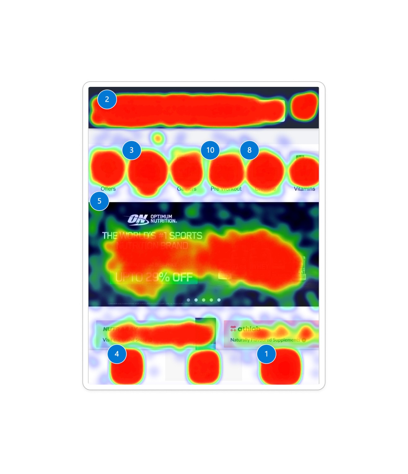
Streamlining Category Exploration
Users often clicked on the Menu and Account tabs for deeper category exploration, presenting an opportunity to make this more accessible and intuitive.
Simplified Order Access
Moved Orders to the bottom navigation bar, allowing users to access their order history with one click, catering to the intent to repurchase.
Optimized First Fold
Replaced redirection links in the first fold with visible product categories, giving users immediate insight into the offerings.
How might we
Improve product exploration through better information architecture?
Help new users grasp the brand’s USPs and find exclusive offers
Highlight the product's authenticity to users instantly?
Improve navigation to make the experience personal & seamless.
The solution

Simplified Navigation
Utilize visuals alongside words to enhance communication with our users.
Authenticity Callout
Recognize and appreciate small achievements by incorporating kudos and thumb-ups for completing daily tasks.


Context Based Product listing
Recognize and appreciate small achievements by incorporating kudos and thumb-ups for completing daily tasks.
Space to promote own brand products
Recognize and appreciate small achievements by incorporating kudos and thumb-ups for completing daily tasks.
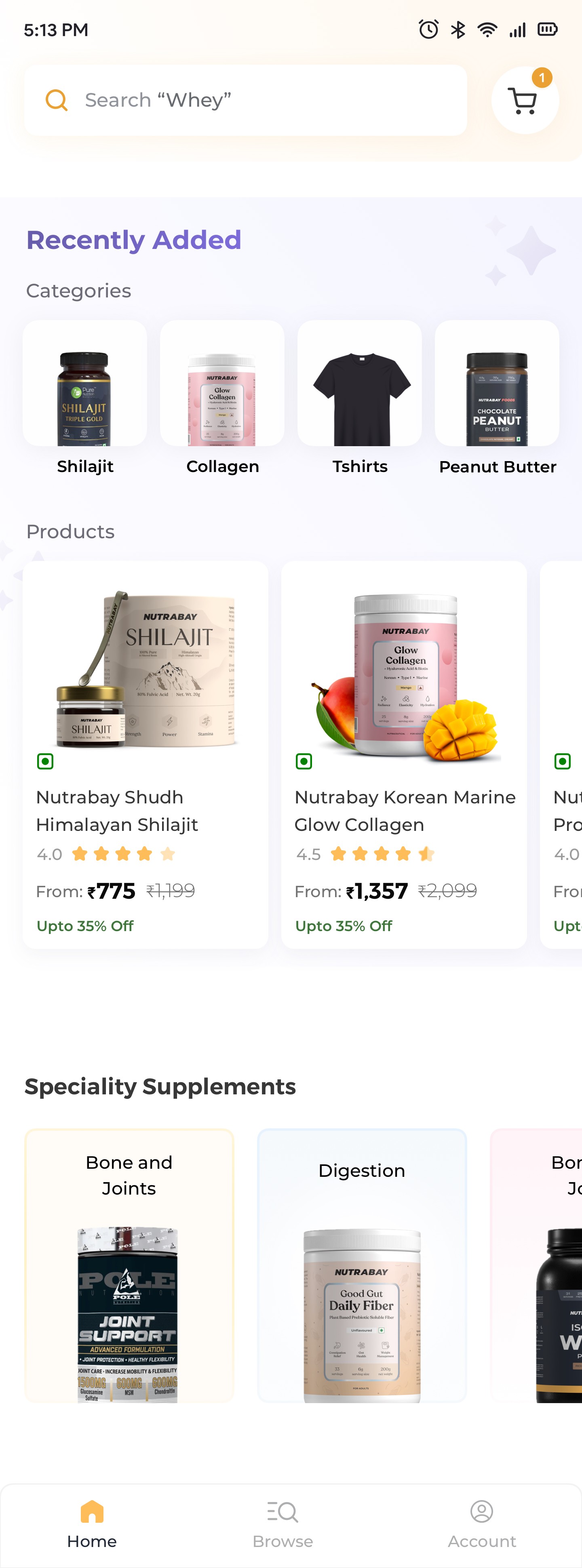
Special Categories space for more discovery
Recognize and appreciate small achievements by incorporating kudos and thumb-ups for completing daily tasks.