Nutrabay Fit Club

Boosting User Retention with a Loyalty Program

Role

Entire UI & UX Design

Team Size

A Lead Designer(Me)
team of product managers.

Project Length

1-2 Months

Date

August 2024

Goal

Scalable reward program to increase customer retention by offering rewards and incentives for repeat purchases.

Results

The end result is a user-friendly and scalable loyalty module that makes it easy for users to earn and redeem reward points.

Research Insights

Users like when offers, coins, and savings are easy to find and shown upfront.


Users want simple, transparent loyalty programs with visible benefits.

Cost-effectiveness and trust are key; hidden fees reduce confidence.

Personalized rewards, milestones, and savings stats increase satisfaction.

Status and Recognition: Higher tiers offer a sense of VIP status and accomplishment.

Clear milestones and benefits encourage users to engage more.

"I kept items in my cart to hit the 2k mark and get a free gift.

Showing stats about money saved motivates continued use.


They want cost-effective programs where savings are greater than the cost.

"If I can recover the cost soon, I’ll buy it."

User expectations of the loyalty program

  • Fulfill the benefits of the program

  • On time commmunication

  • Be Transparent and trust-worthy

  • Get more benefits than other customers as they are spending extra

  • Save maximum money 

  • Not spend too much time 

  • Feel special

How Might We

Make loyalty program details easy to find?

Prominently display rewards and savings?

Build trust through transparency and clear costs?

Streamline rewards redemption?

Information Architecture

About the loyalty Program

  • There are three tiers of the program, each differs for the user in terms of spending and earning of the currency which is NB Coins.

  • Each NB Coin equal one rupee for the user.

  • User gets upgraded to the next tier based on their overall spending on the app.

Final Solution

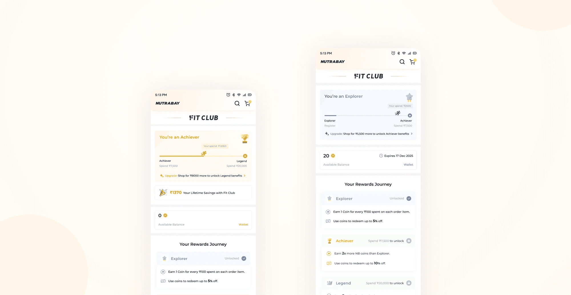
Fit Club Landing page
This is the page where user lands and views all the program details. The design gives priority to program benefits and lets user know the ways to earn and redeem.

Fit Club Page after joining the program
User can view their progress in their journey into the program.
User gets a subtle nudge to upgrade themselves to the next tier

Savings Display
User is shown in a celebratory way all the savings they have done through the program, this gives user a positive reinforcement.

Journey Transformation
Through visuals user can understand their current stage of the program and the benefits they have unlocked giving user a clear overall picture.

Wallet
This page gives user the detail on their spending and balances of NB Coins. User also has the knowledge of their coins expiry.

Spending limits
As the spending limits differ through each program, we made a clear table which lets user know their spending limit according to the current level and how it can change as user upgrades.

Coin Redemption on Cart
User has the cue to redeem their exisiting coins on the cart through a check box right above the price details. This placement of the widget seems contexually correct and one which user won't miss.

Key Learnings

  • Understanding of Loyalty Programs
    Working on this project gave me a deeper understanding of developing loyalty program strategies and their significant impact on design.

  • Gamification
    Learned about the concept of gamification and applied its principles to our loyalty UX.

  • Thinking of different edge cases

    We encountered many edge cases where the current UX was breaking, such as how to show redemption to users with a negative balance. This gave me an opportunity to design a UX which caters to all such cases.

Product Details Page

Enhancing how users explore and interact with product information

Role

UI & UX Design

Team Size

One designer(Me), one design director, one product manager.

Project Length

2-3 Months

Date

July 2023

Introduction

Product detail page (PDP) is the page where user seeks in depth information about their chosen products.

Results

End result is a 21% Increase in conversion rate from product details page to checkout

Old Design

Insights from heat maps, clarity user sessions and NPS

Before starting the research I divided my users into groups to better understand different types of users who visit our website. Beginner, intermediate and expert gym goers.

Using filters boosts user clicks to 50%, compared to 23% without them, moreover over half of the focus group was unaware of the designs for various events and clothing types.

Many users were unaware of the different print methods available. This suggests that filters might be underused because they are hidden and not easily discoverable.

Insights from NPS

The search bar lacks word suggestions based on user input and only shows one search history option, unlike other sites that display 5-6 recent searches.

The search bar lacks word suggestions based on user input and only shows one search history option, unlike other sites that display 5-6 recent searches.

Learnings from Competitive Research

What works well

Learnings from Competitive Research

Better swatch designs
Clearly display savings for each product variant and price per 100g to help users make informed purchase decisions.

Simplified Product Info Table:

Redesign the product information table for better readability and ease of understanding.

Concise Product Highlights:

Present key product benefits in a digestible format, eliminating the need to read lengthy paragraphs or lists.

Authenticity Through Lab Reports:

Provide product lab reports to address user concerns about authenticity and build trust.

Seamless Image Browsing:

Use an open gallery format for product images, enabling users to view them without additional clicks.

Improved Navigation with Sticky Bar:

Added a sticky bar with scroll-to buttons for smoother navigation and a 'Back to Top' button for quick access to the start of the page.

More engaging offers section

Made the offers more engaging with strategic nudges and clear categories for easier discovery. Added space and used a contrasting background color to make them unmissable

Improved ratings section

Improved review scanability with color-coded ratings. Simplified sorting with fewer clicks and precise star rating filters. Added tags for purchased product variants, enabling quicker decisions. Enhanced review card hierarchy to reduce cognitive load.

Can be improved

Limited First Fold Information

Large product images and poor layouts reduce the visibility of key information in the first fold, making it harder for users to get the details they need quickly.

Hidden Information

Product variants and offers are not immediately visible, requiring extra clicks or scrolling.

Flavors and weights are hidden behind additional steps, which could confuse users.

Dense or Difficult-to-Consume Details

Long product info tables and dense bullet points make it hard for users to quickly digest important information.

Product Imagery & Hierarchy

Large, detailed images and well-placed visuals help users evaluate products instantly, without extra clicks.

Prioritizing images in the product hierarchy ensures they appear before other information, catching user attention first.

Information Accessibility

Progressive overviews allow users to skim key details quickly, reducing cognitive load.

Nutritional info is grouped or strategically displayed to support decision-making.

Discounts are highlighted in unique formats, grabbing user attention effectively.

Visually Distinct USPs

Clear visual presentation of USPs highlights product strengths effectively and attracts attention.

Create a free website with Framer, the website builder loved by startups, designers and agencies.