Product Details Page
Real-Time Currency Tracking and Analysis
Role
UI & UX Design
Team Size
A Lead Designer(Me)
team of product managers.
Project Length
1 Month
Date
December 2024
Introduction
Product detail page (PDP) is the page where user seeks in depth information about their chosen products.
Results
End result is a 21% Increase in conversion rate from product details page to checkout
Old Designs
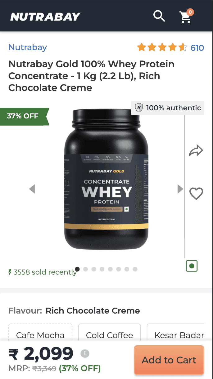
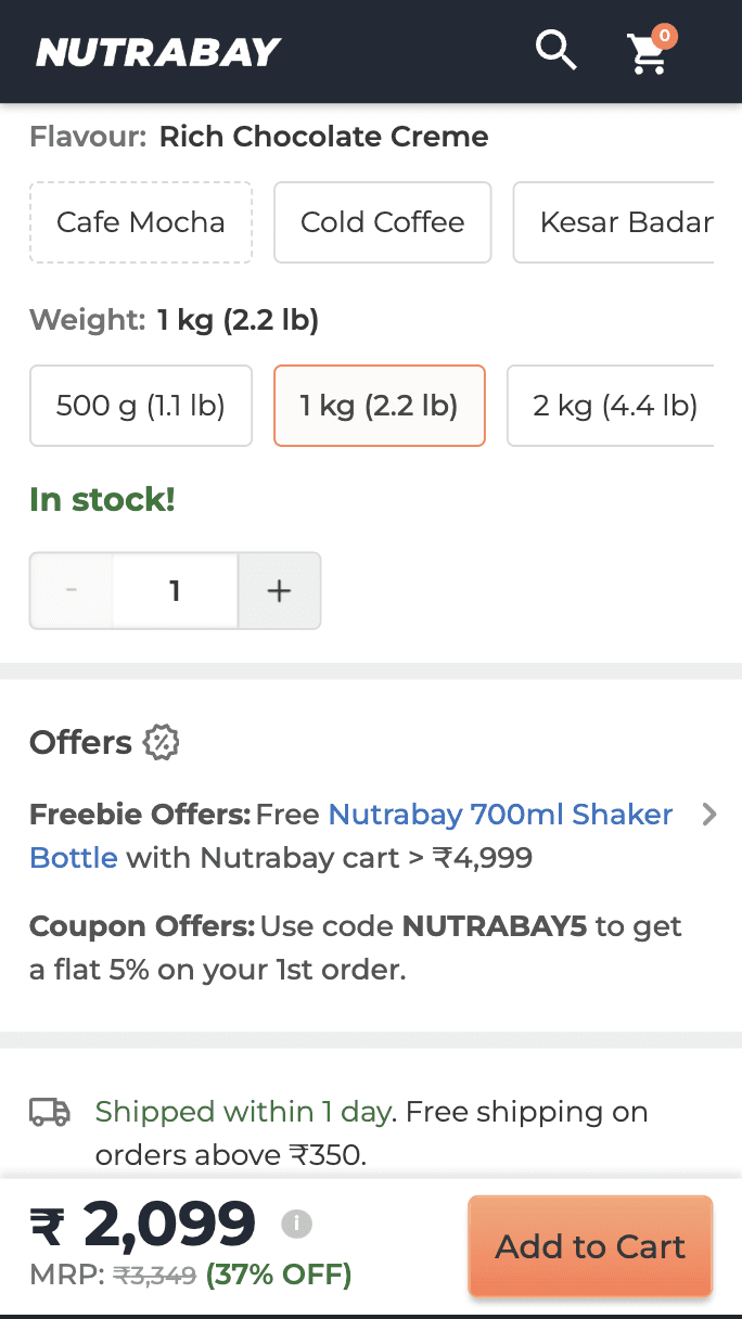
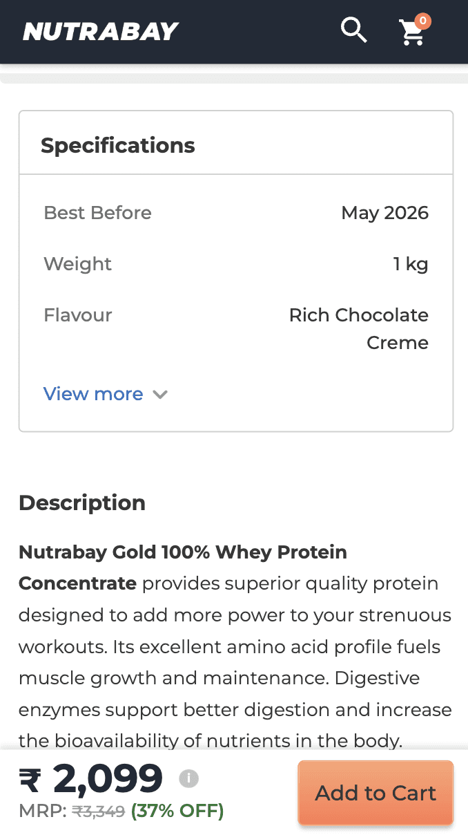
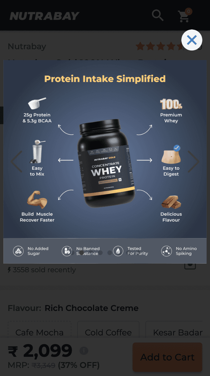
Insights from heat maps, clarity user sessions and NPS
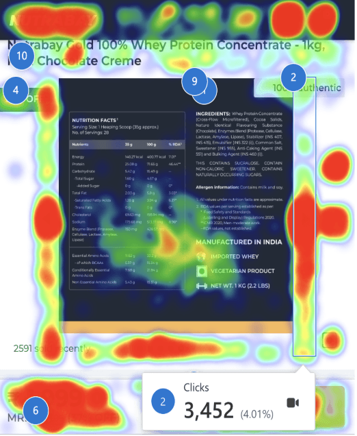
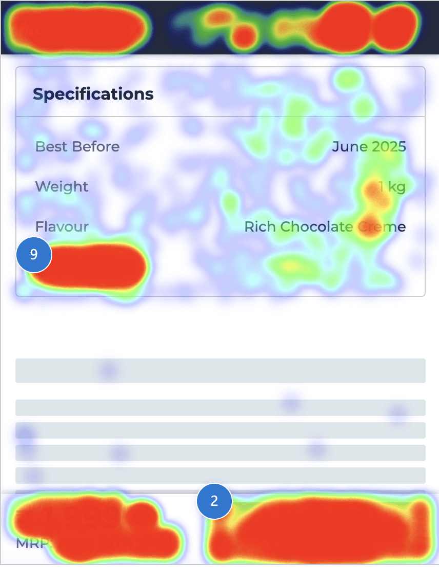
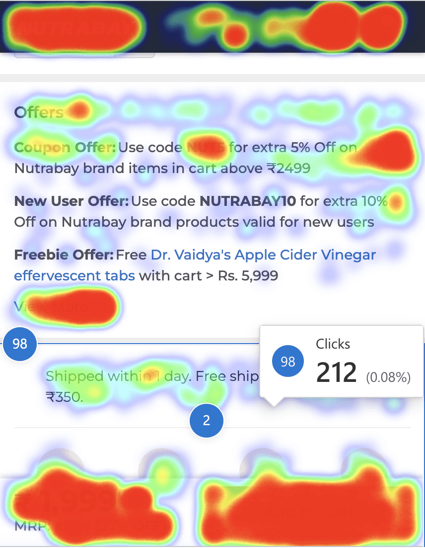
Users struggle to find complete nutrition and ingredient info easily.
Users visit the PDP swipe through different flavours and sizes and then leave the page
This layout is clunky and lacks clear hierarchy, making scanning and action difficult.
Does not clearly communicate the key benefits of the product, which makes it difficult for user to make an informed decision.
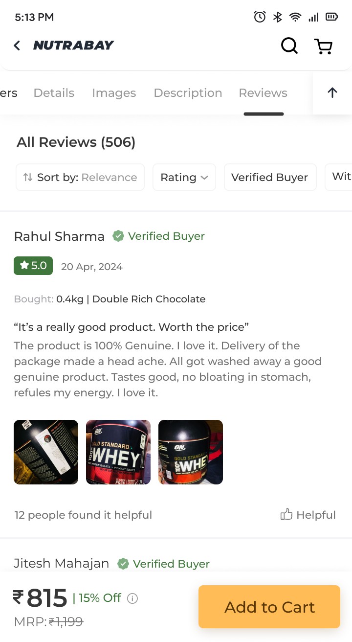
Ratings UX is old and difficult for user to skim through.
Difficulty in finding product details and descriptions.
Insights from NPS
Users value Nutrabay for authentic products, attractive deals , and wide variety of brands on one platform.
"Health & Fitness" and "Bodybuilding" are the top two goals, followed by "Weight Loss."
Learnings from Competitive Research
What works well
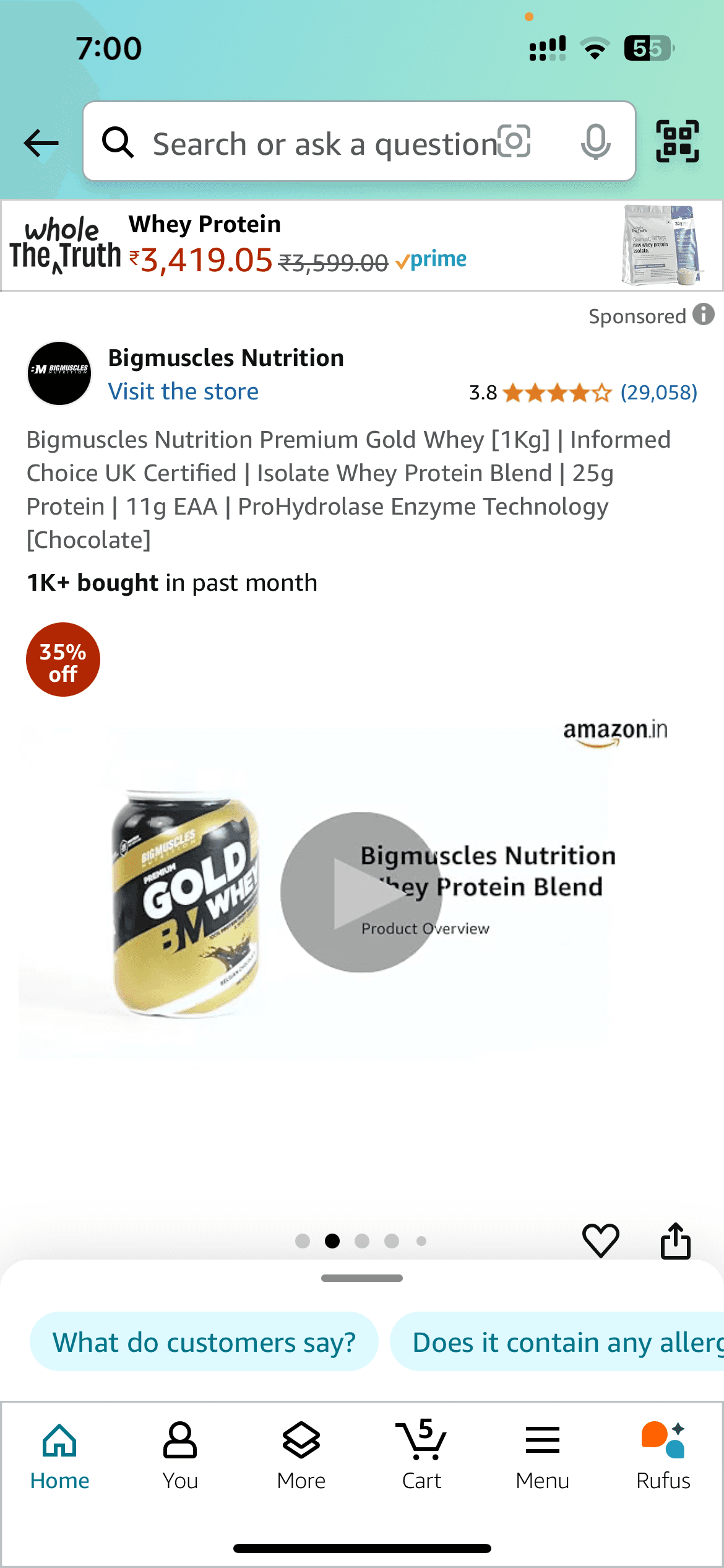
Amazon
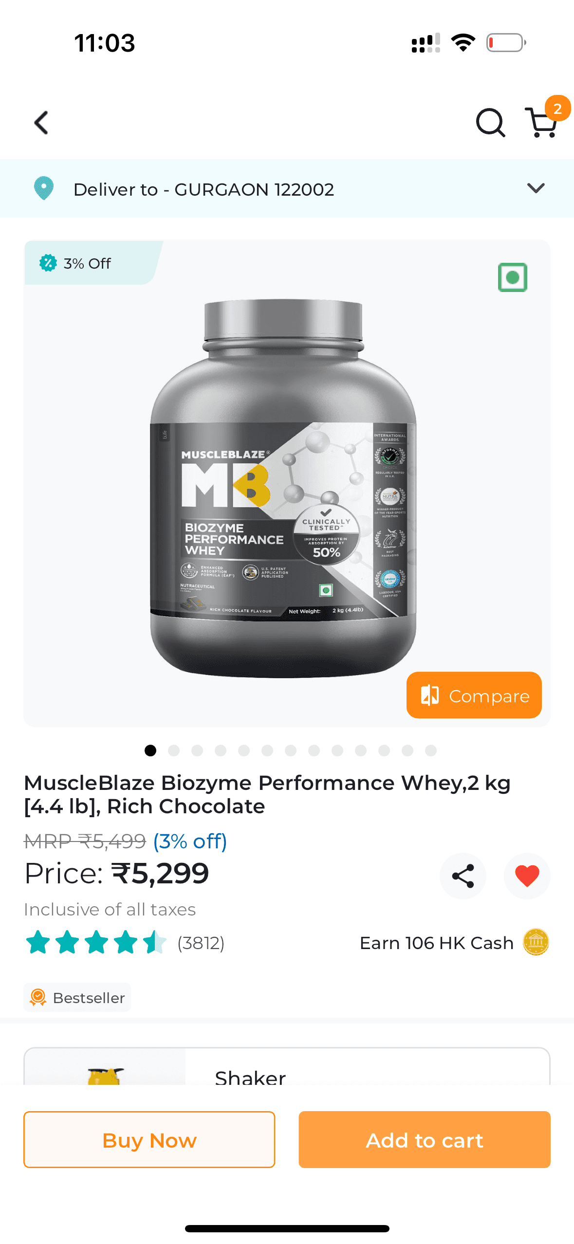
Healthkart
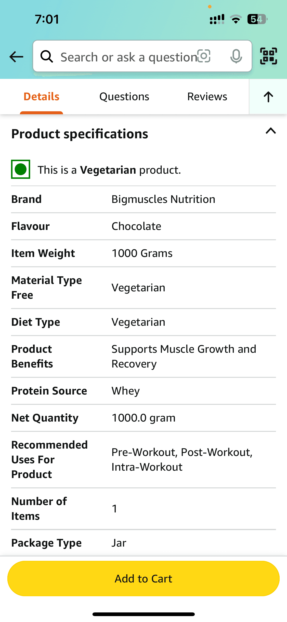
Amazon
Product Imagery & Hierarchy
Large, detailed images and well-placed visuals help users evaluate products instantly, without extra clicks.
Prioritizing images in the product hierarchy ensures they appear before other information, catching user attention first.
Information Accessibility
Progressive overviews allow users to skim key details quickly, reducing cognitive load.
Nutritional info is grouped or strategically displayed to support decision-making.
Discounts are highlighted in unique formats, grabbing user attention effectively.
Visually Distinct USPs
Clear visual presentation of USPs highlights product strengths effectively and attracts attention.
Can be improved
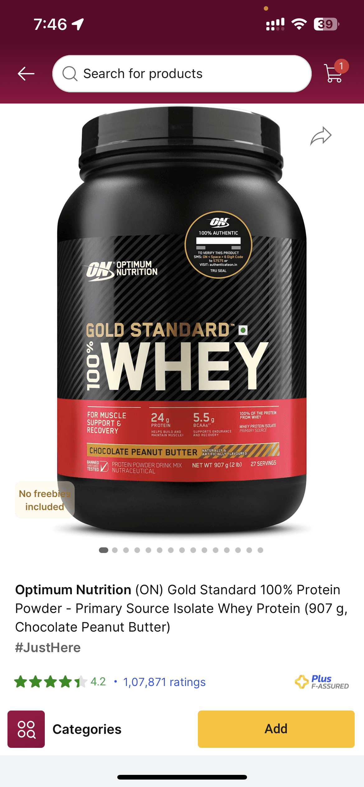
Flipkart
Healthkart

Optimum Nutrition
Limited First Fold Information
Large product images and poor layouts reduce the visibility of key information in the first fold, making it harder for users to get the details they need quickly.
Hidden Information
Product variants and offers are not immediately visible, requiring extra clicks or scrolling.
Flavors and weights are hidden behind additional steps, which could confuse users.
Dense or Difficult-to-Consume Details
Long product info tables and dense bullet points make it hard for users to quickly digest important information.
Final Solution
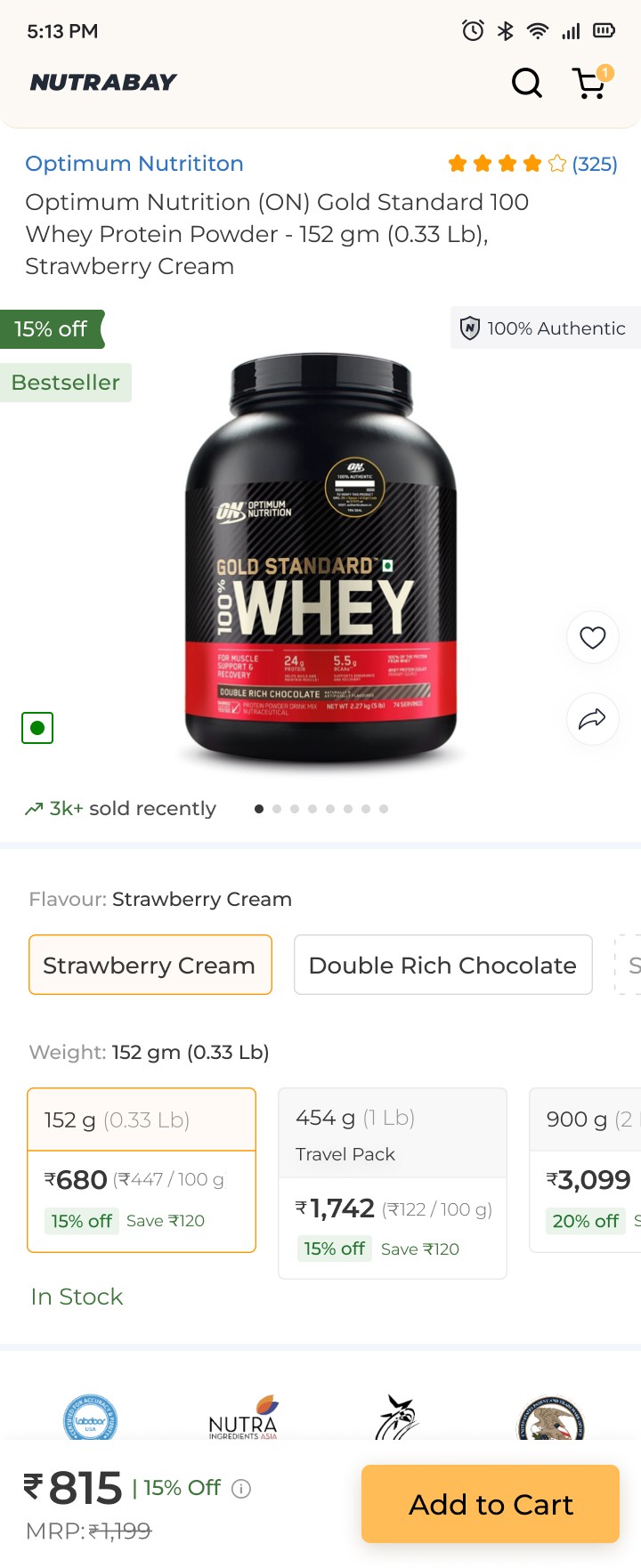
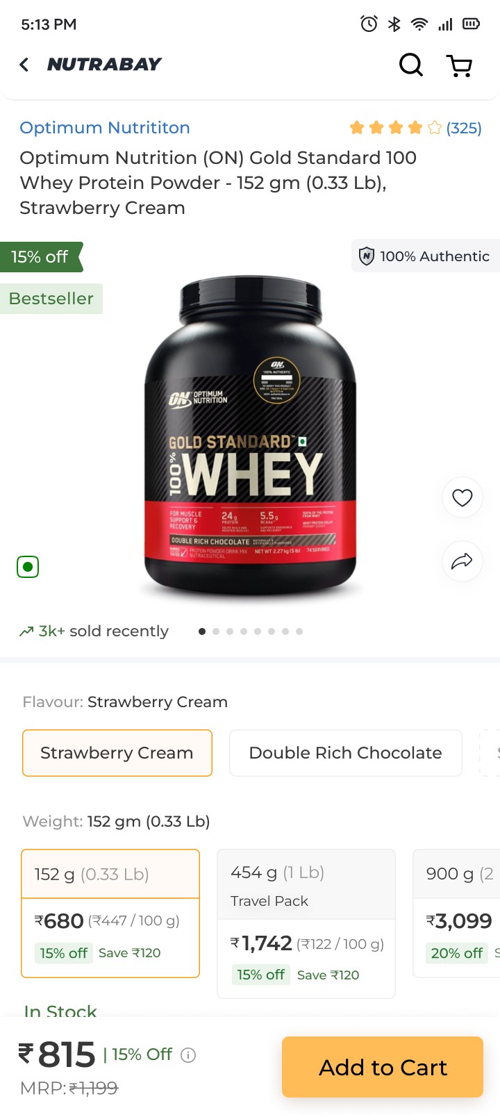
Better swatch designs
Clearly display savings for each product variant and price per 100g to help users make informed purchase decisions.
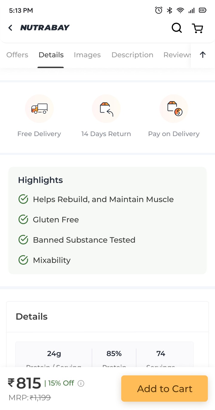
Concise Product Highlights:
Present key product benefits in a digestible format, eliminating the need to read lengthy paragraphs or lists.
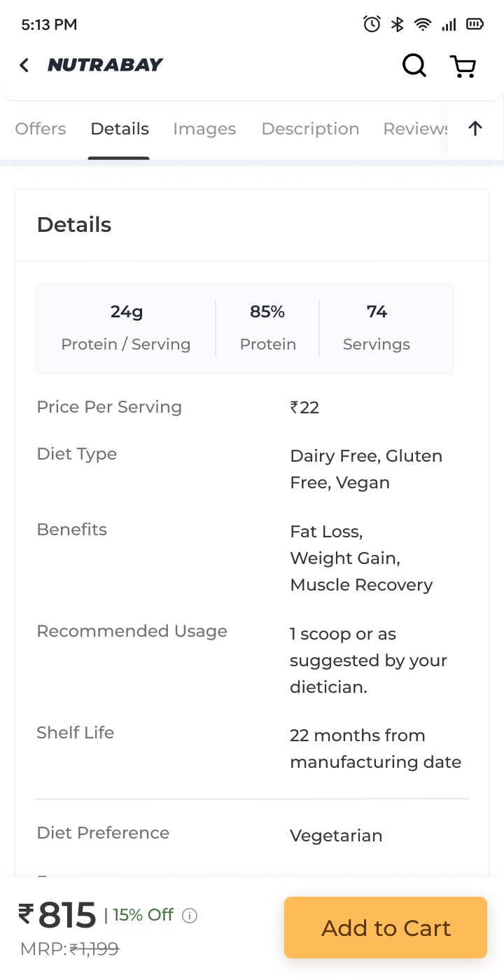
Simplified Product Info Table:
Redesign the product information table for better readability and ease of understanding.
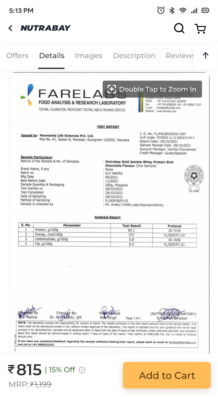
Authenticity Through Lab Reports: Provide product lab reports to address user concerns about authenticity and build trust.
Seamless Image Browsing:
Use an open gallery format for product images, enabling users to view them without additional clicks.
Improved Navigation with Sticky Bar: Added a sticky bar with scroll-to buttons for smoother navigation and a 'Back to Top' button for quick access to the start of the page.
More engaging offers section
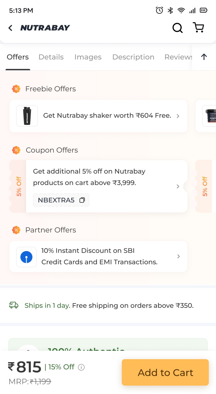
Made the offers more engaging with strategic nudges and clear categories for easier discovery. Added space and used a contrasting background color to make them unmissable
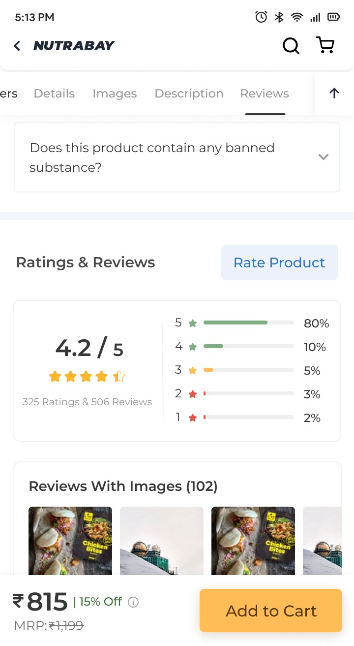
Improved ratings section
Improved review scanability with color-coded ratings. Simplified sorting with fewer clicks and precise star rating filters. Added tags for purchased product variants, enabling quicker decisions. Enhanced review card hierarchy to reduce cognitive load.